Turning a peer-reviewed video library into an adaptive AI coach.
Overview
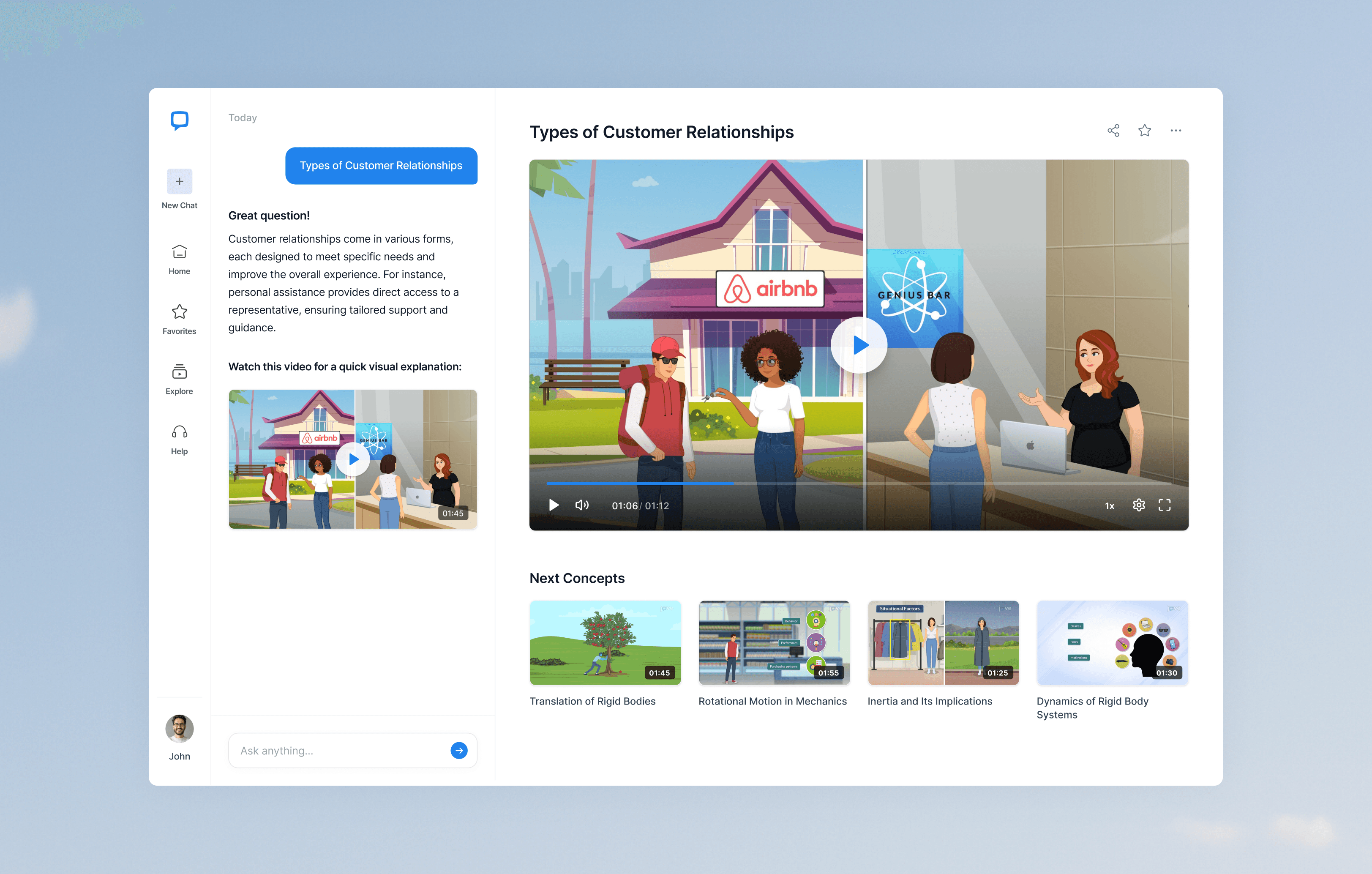
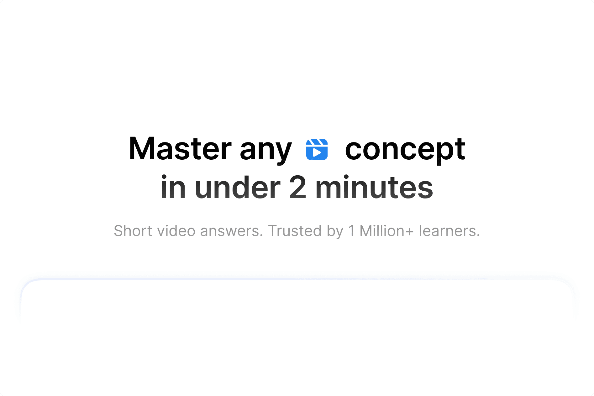
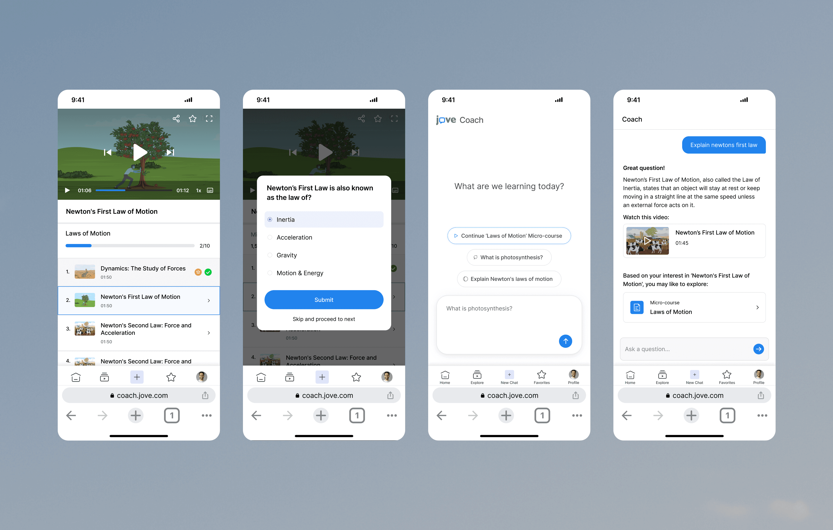
JoVE is trusted by universities and researchers for its peer-reviewed science videos. Entering the B2C space meant starting fresh — a library on its own doesn't teach anyone. I designed JoVE's first B2C product as an AI coach that answers questions instantly and guides learners through bite-sized micro-courses with quizzes, progress tracking, and certificates. A learner can start with a single doubt and finish with a certificate without ever browsing.
Challenge
A library gives you content. It doesn't guide you. Learners need something that feels like a coach — answers instantly, walks them through step by step, and keeps the motivation alive. The wrinkle is that learners arrive with two very different intents.
Doubt-first. Just want a quick answer and to move on
Structured. Want a guided course and a certificate at the end
User interviews surfaced three frustrations on the existing experience: endless browsing with no clear next step, no sense of achievement after a video, and no signal for what to watch next. A competitive scan across Khan Academy, Coursera, Skillshare, and Udacity confirmed three things actually drive engagement at scale — progression, quizzes, and certificates.
Role
I designed the end-to-end adaptive learning product across web and mobile, owning the system from research through ship-ready specs.
- Mapped both learner intents and the path between them
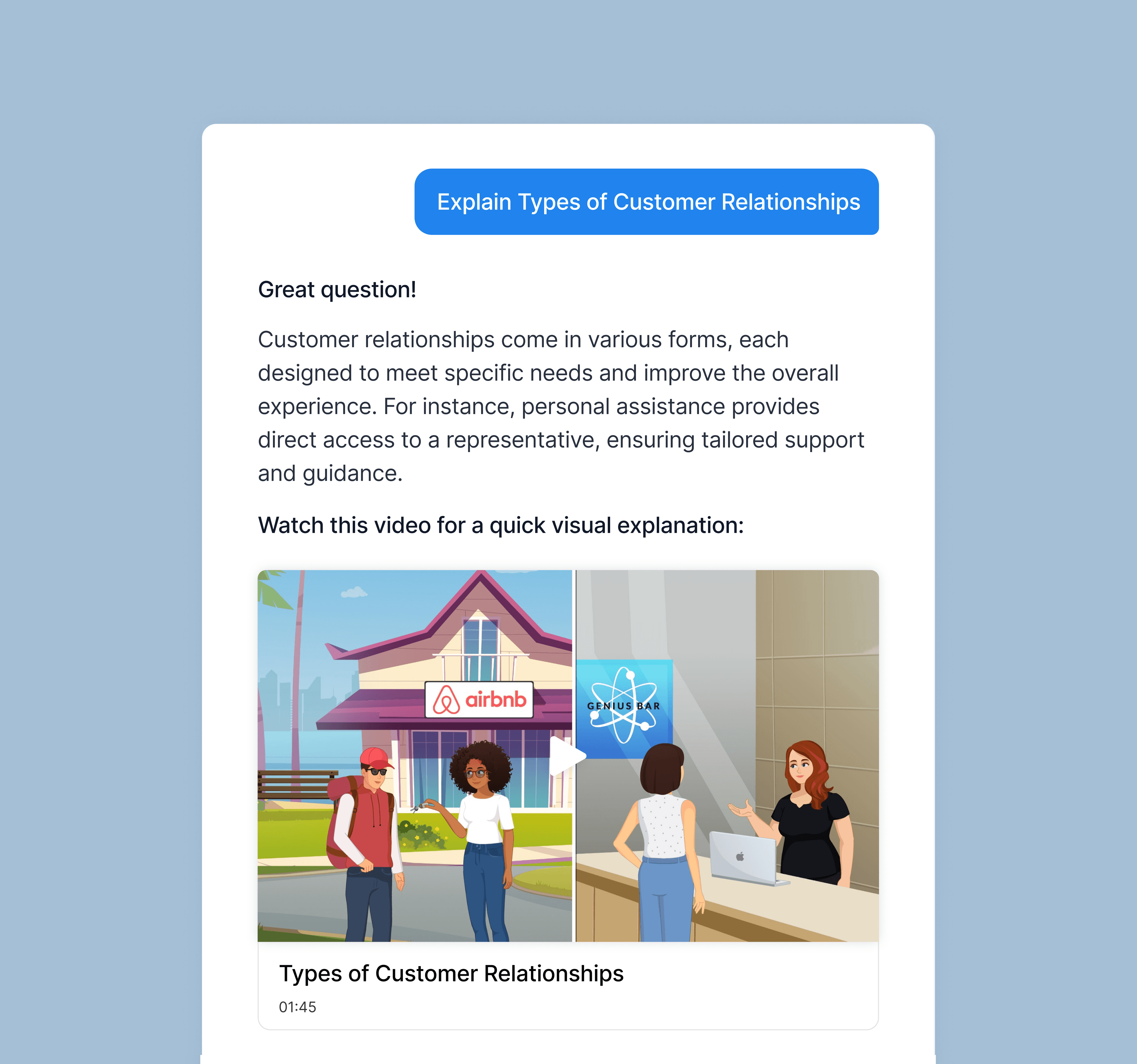
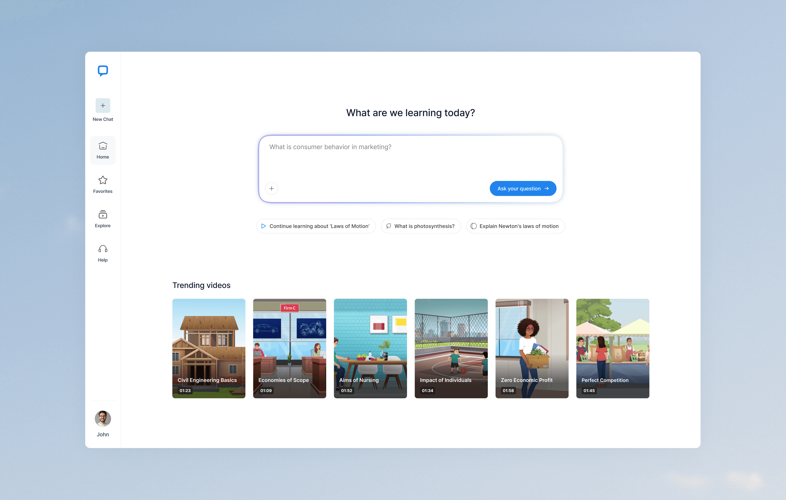
- Designed the chat-as-coach pattern that became the product's spine
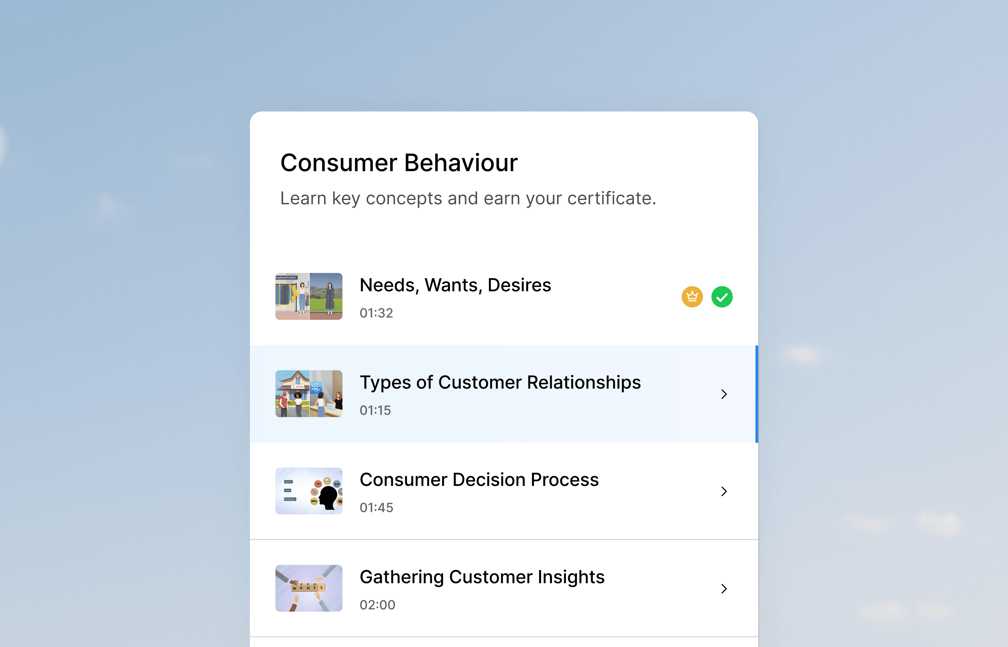
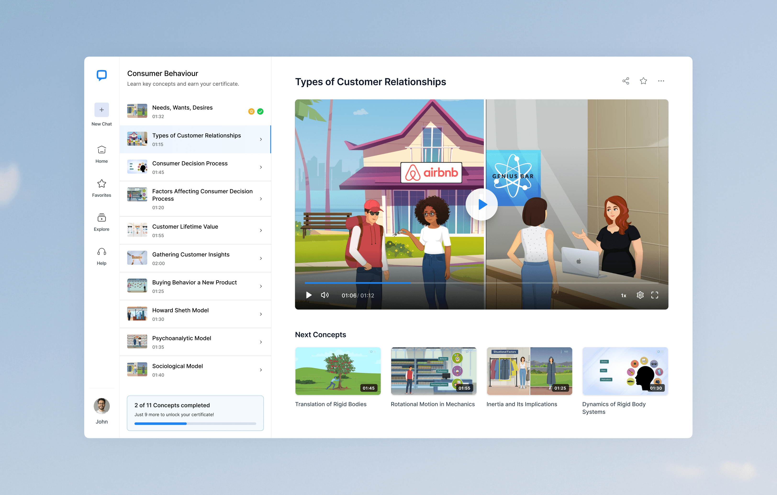
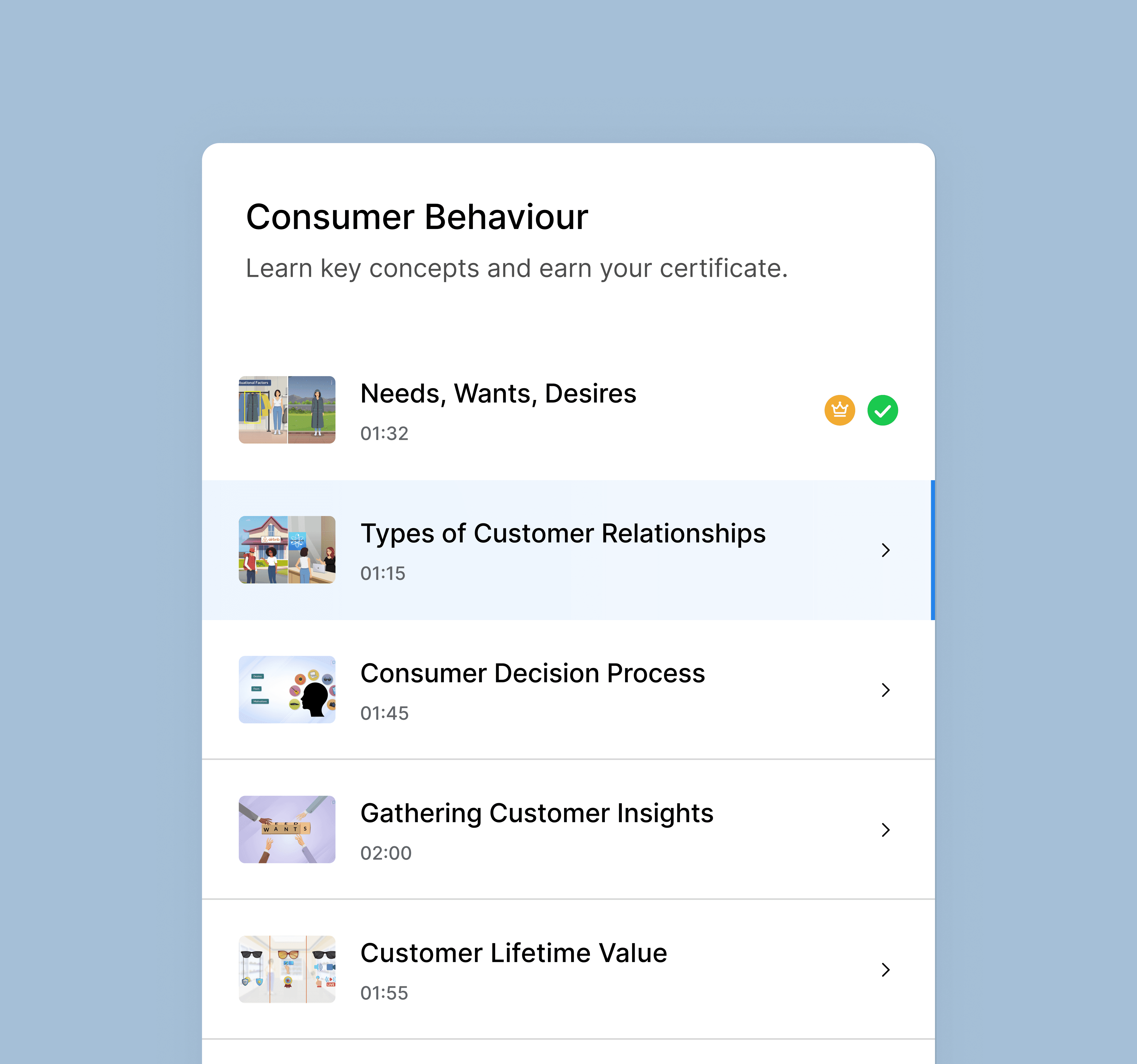
- Built the structured micro-course flow with embedded quizzes and certificates
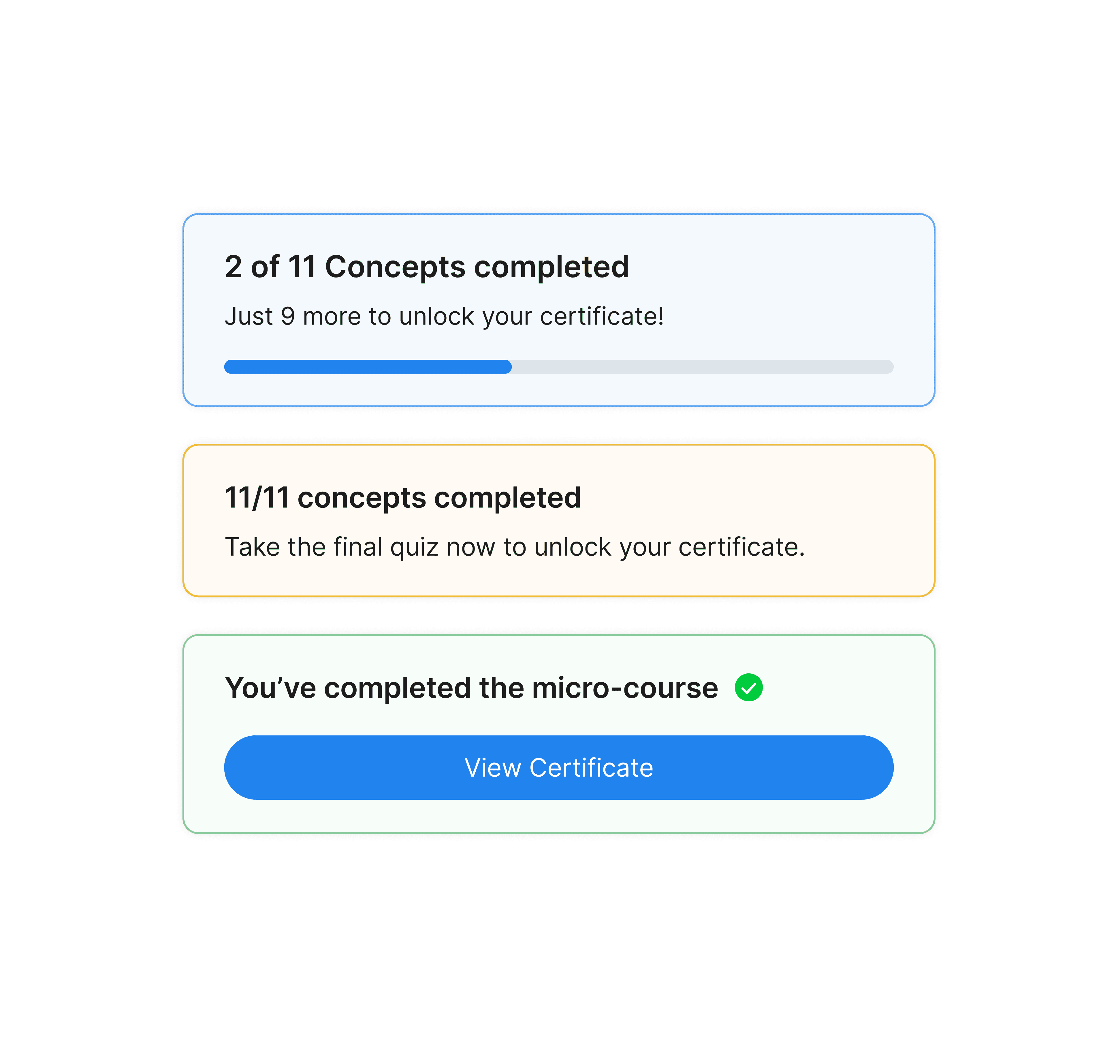
- Designed the progress system. Rings, sticky bars, and copy that nudges without nagging
- Shipped a mobile experience that mirrors desktop without diluting it
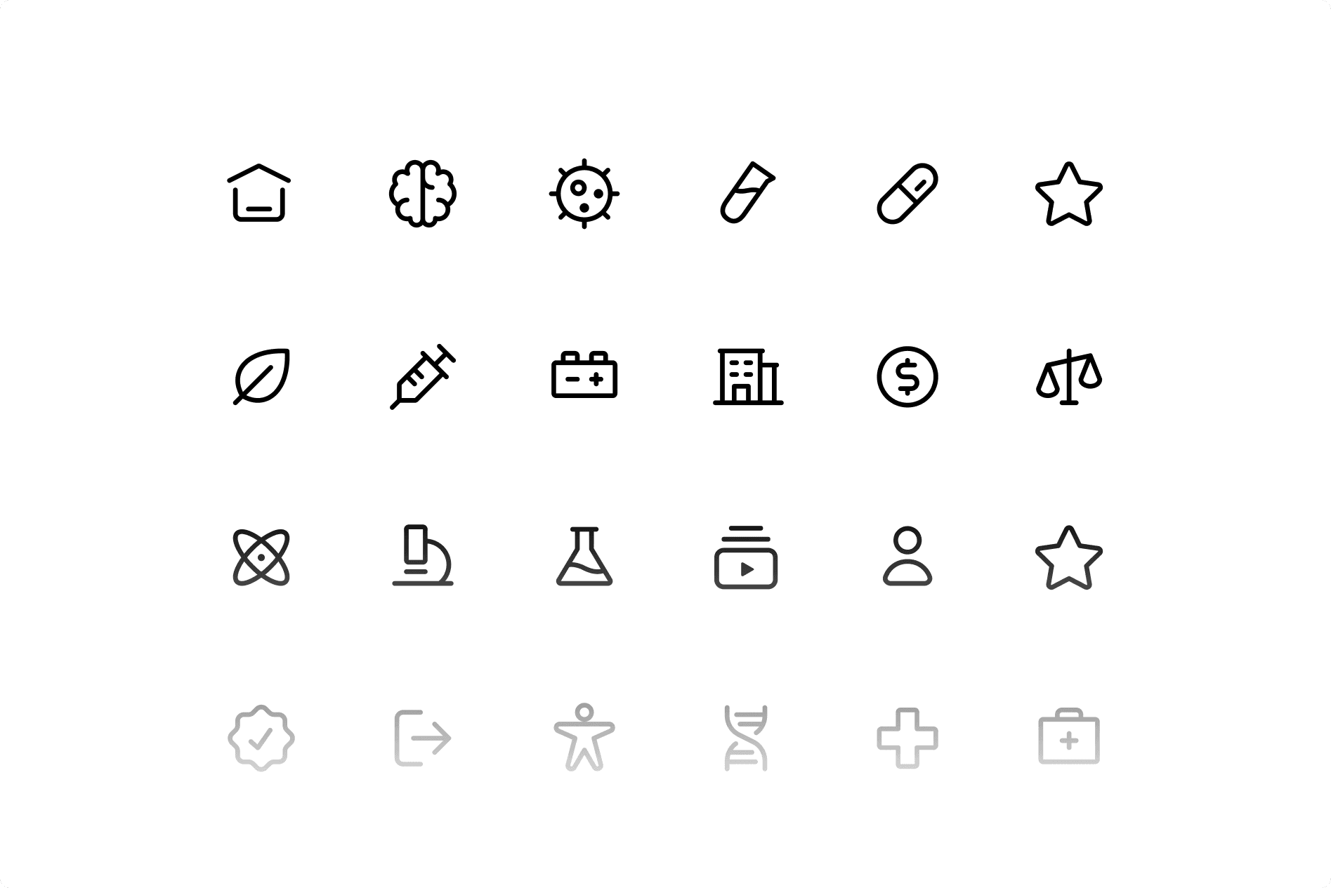
- Built the visual system. Illustrations, icons, type, and a supportive tone of voice
Approach
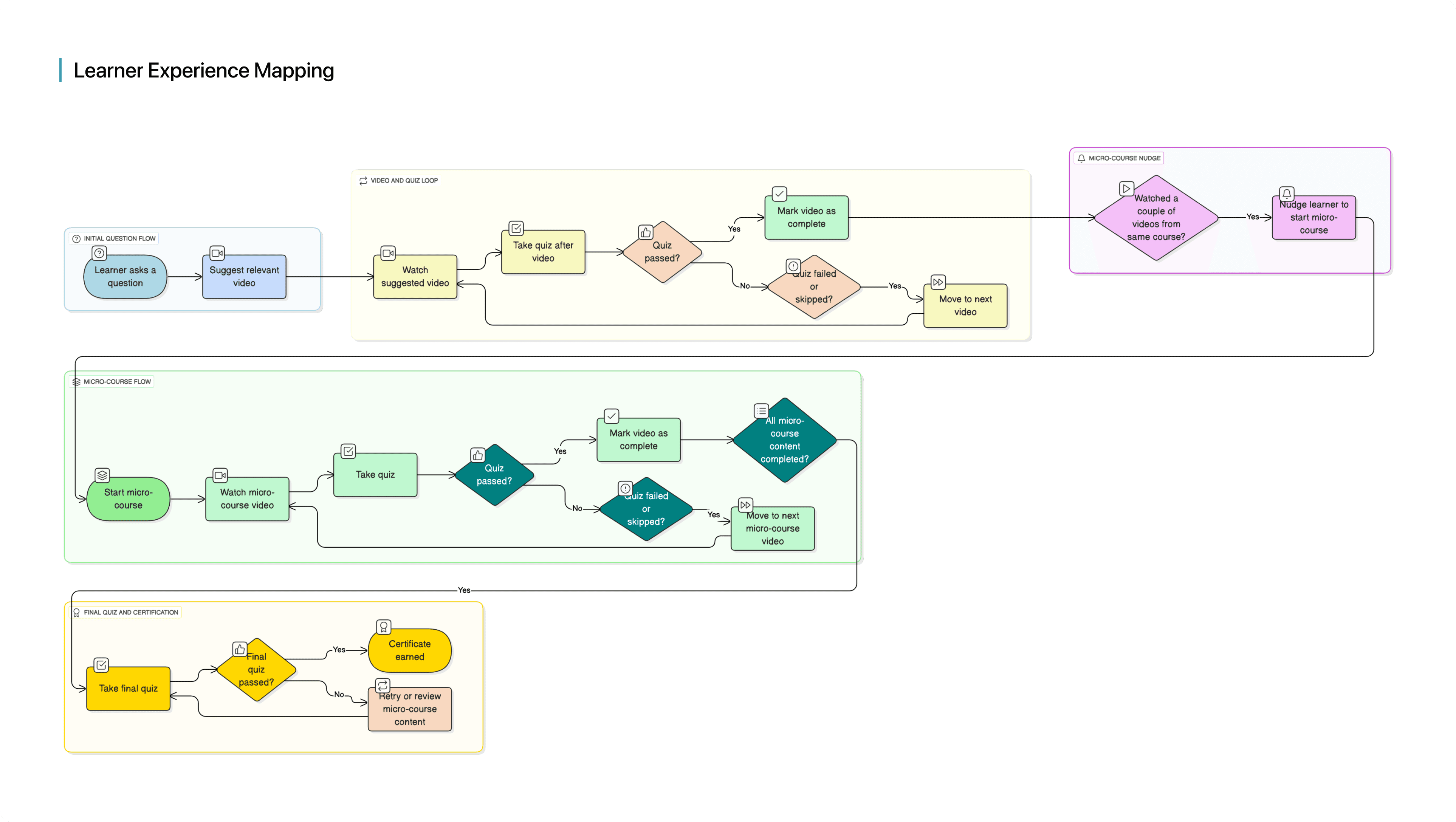
Early on I kept asking the same question. How does one product serve a doubt-first learner and a structured learner without splitting into two? Two separate modes felt logical at first — and they were the first thing I threw away. The cleaner answer was a single adaptive journey.
- Ask a question → short video → quick quiz → nudge into a related micro-course → certificate
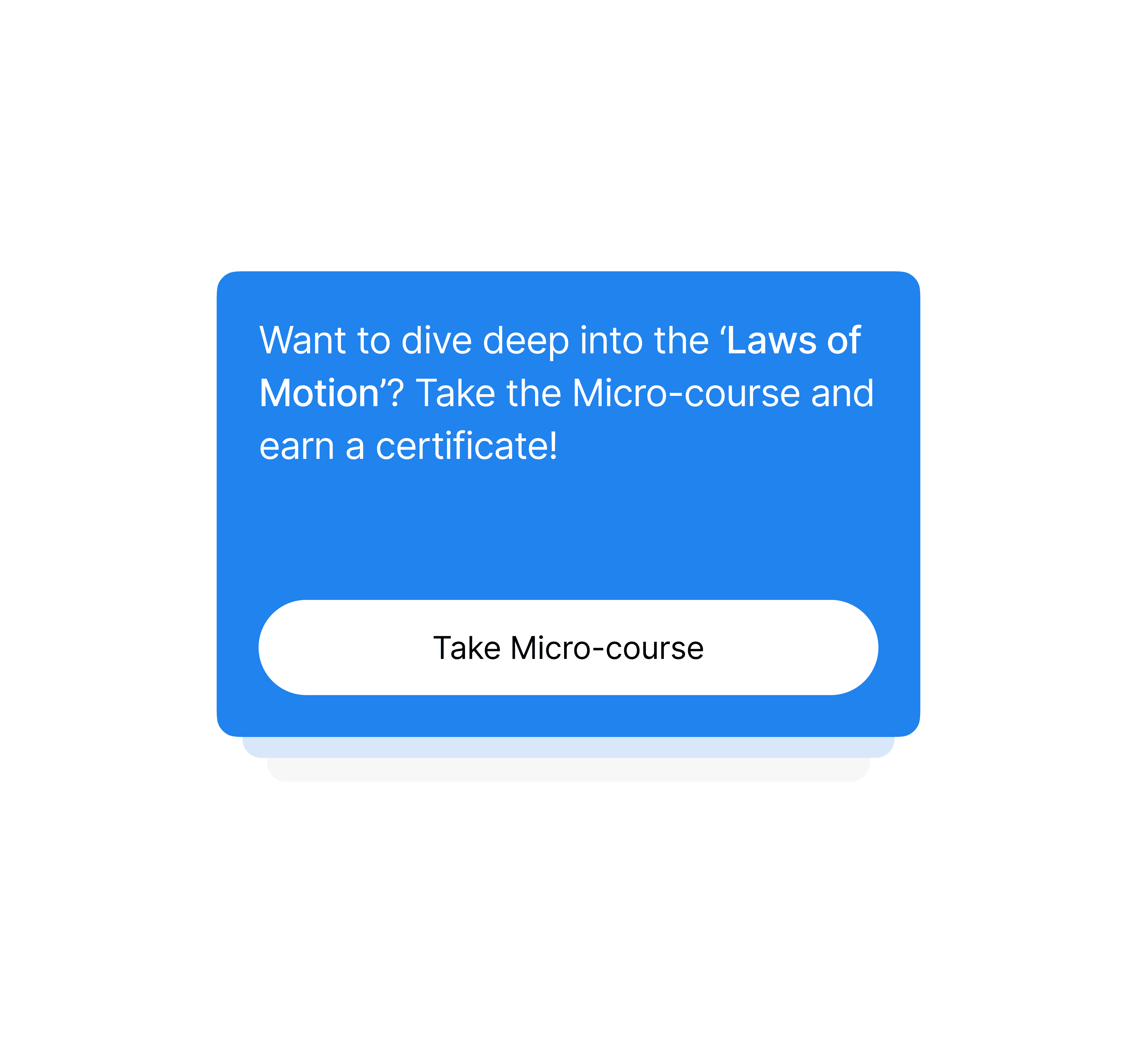
- The principle. Don't force a choice. Let the experience surface the next step naturally
- In beta, 42% of doubt-first learners continued into a micro-course off the back of that flow
Solution
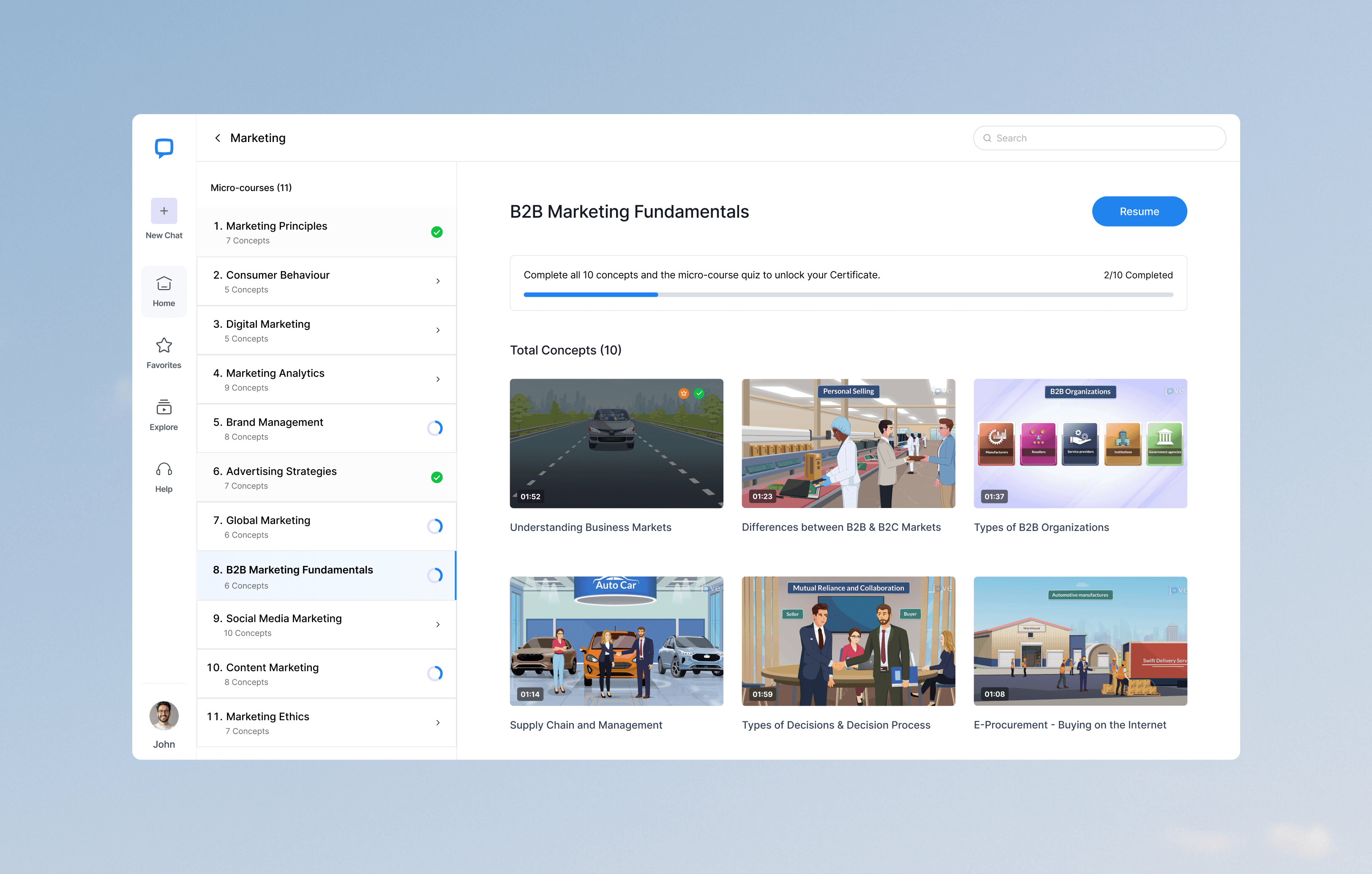
JoVE Coach is six tightly-coupled building blocks.
- Chat as the coach. Conversational, action-oriented, context-aware. Drove 35% longer sessions vs the video-only experience
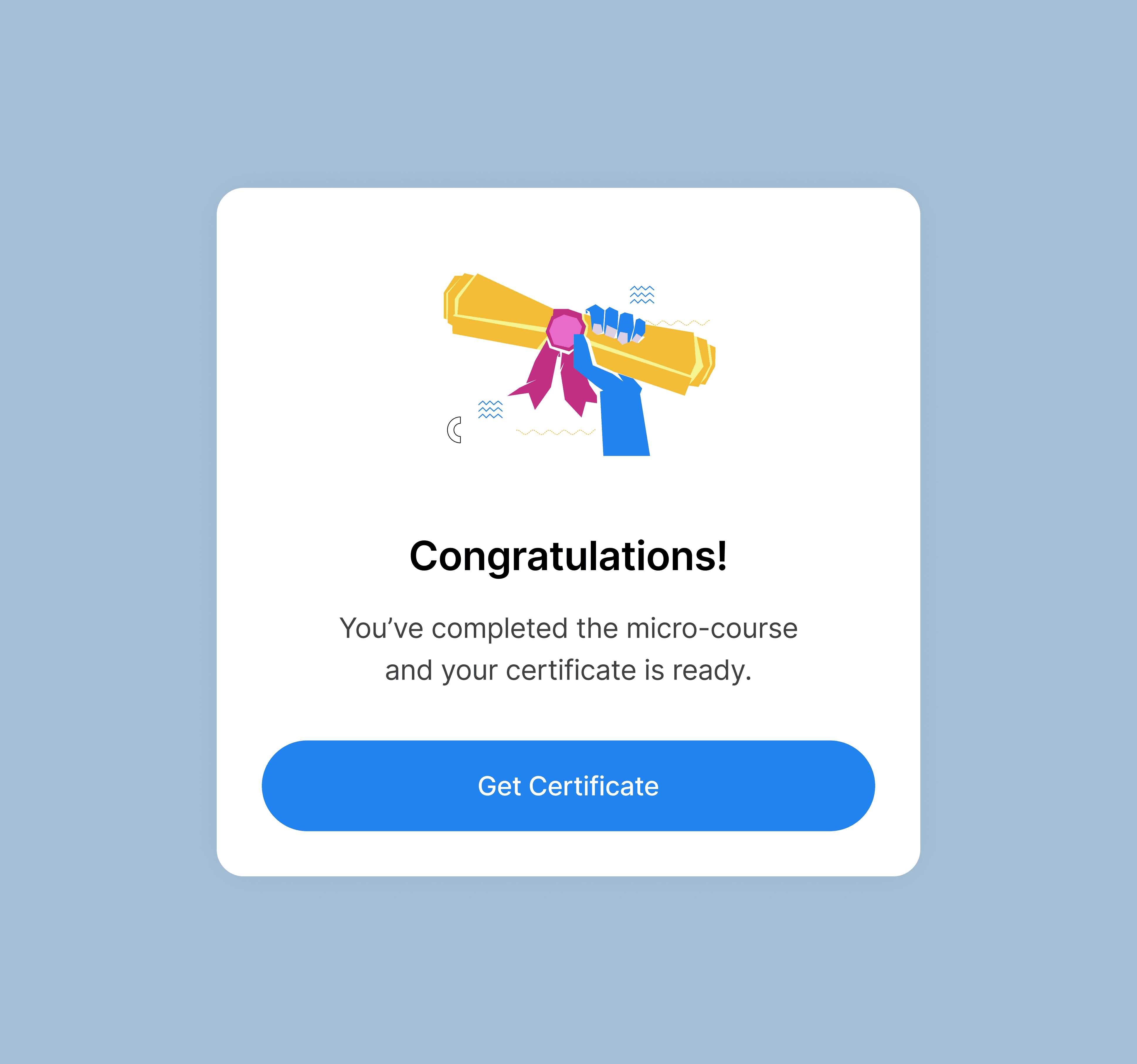
- Structured micro-courses. Bite-sized videos, embedded quizzes, and a final certificate quiz. 3x more certificates earned vs JoVE's previous baseline
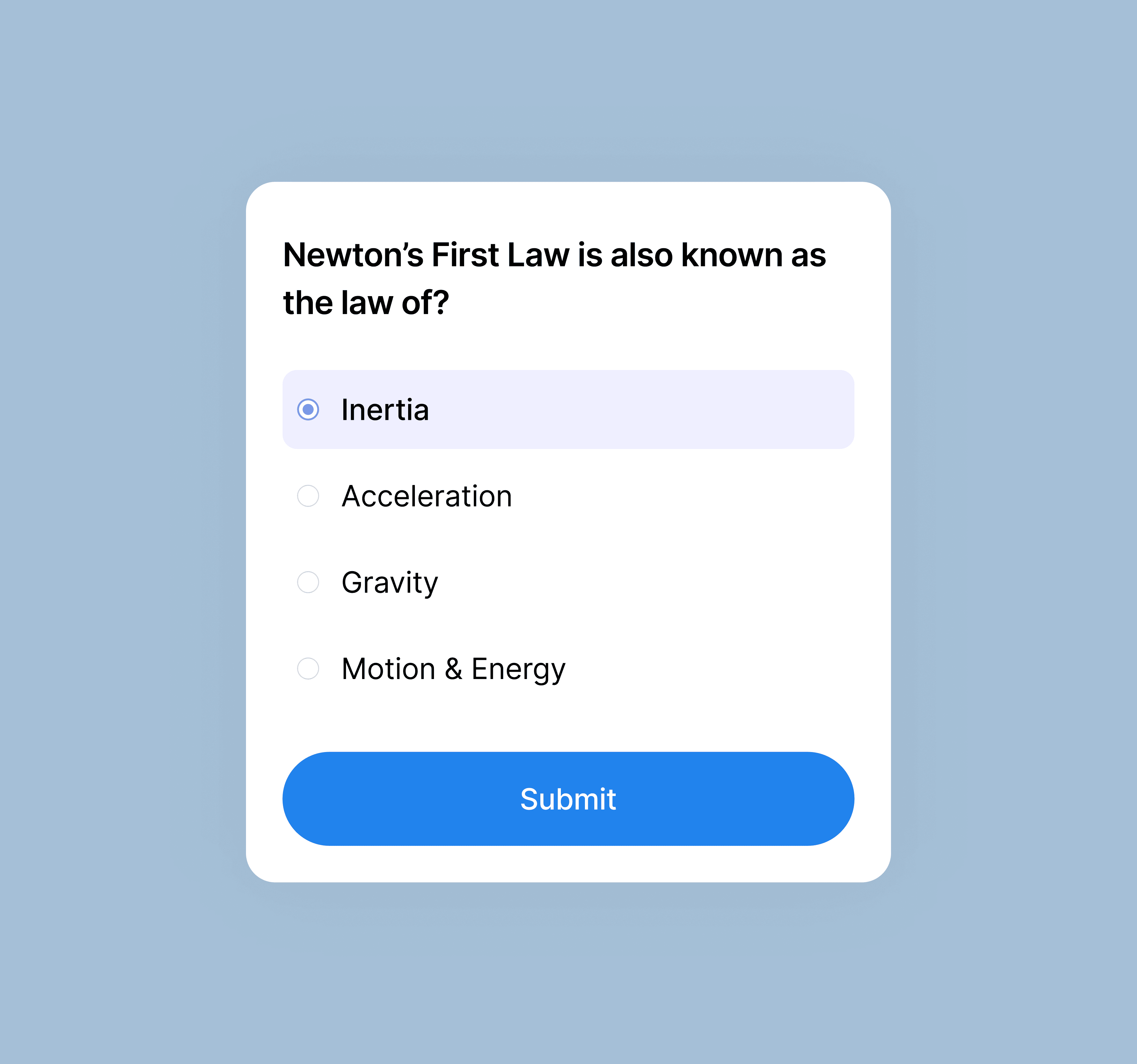
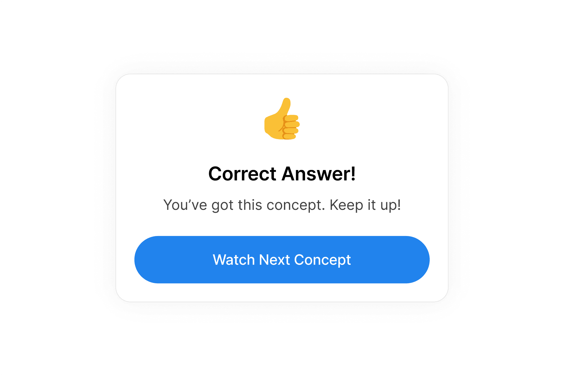
- Quizzes after concepts. Turn passive watching into active recall and prep for the cert
- Visible progress. Rings, sticky bars, and microcopy like 'concepts done, certificate in sight'. 22% lift in completions
- Nudges at the right moment. Only surfaced after related content, not in the middle of a flow. 18% fewer drop-offs
- Moments of delight. Confetti and milestone overlays at the right beats. Learners who hit one were 1.5x more likely to continue
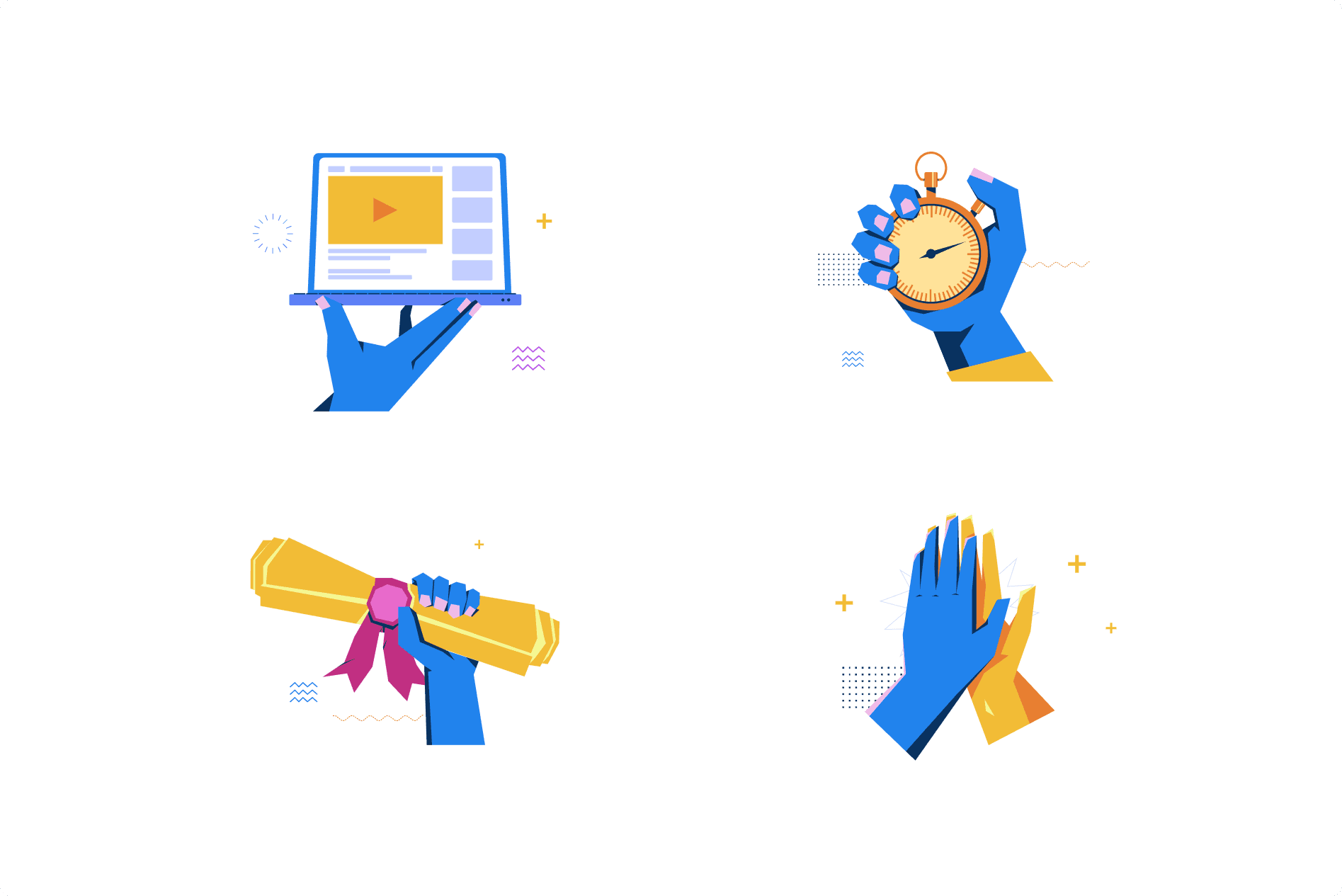
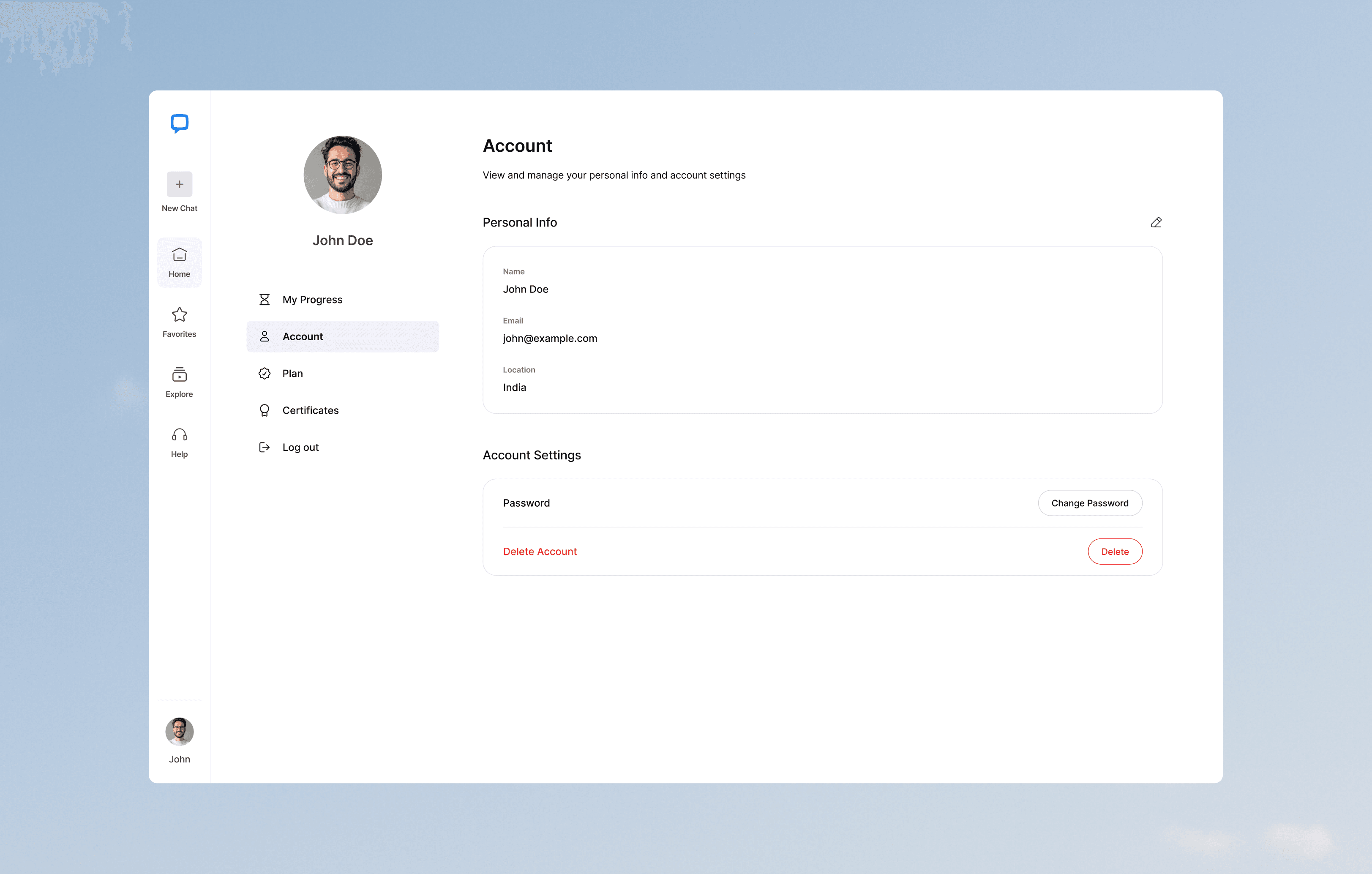
- A design system with playful illustrations, a unified icon set, simplified typography with generous whitespace, and a supportive tone — built so the product feels human, not academic
42%
Doubt-first learners progressed to a course
3x
More certificates earned
27%
Lift in course completions
35%
Longer sessions
Key takeaway
“The best design decision on this project was the one I deleted. Two separate modes felt logical on paper. One adaptive flow proved far more effective in practice. Learners stay longer, complete journeys, and earn certificates without ever feeling lost in a catalog.”